
发布时间:2023 年 11 月 8 日
用户输入是任何用户界面中最敏感的问题之一。一个可用的应用程序必须帮助用户查看、理解和修复其输入中的任何错误。:user-valid 和 :user-invalid 伪类选择器通过仅在用户更改输入后才提供有关错误的反馈,从而帮助改善输入验证的用户体验。有了这些新的选择器,不再需要编写有状态的代码来跟踪用户已更改的输入。
用户交互伪类选择器
:user-valid 和 :user-invalid 伪类选择器与现有的 :valid 和 :invalid 伪类相似。两者都根据表单控件的当前值是否满足其验证约束来匹配表单控件。但是,新的 :user-valid 和 :user-invalid 伪类的优势在于,它们仅在用户与输入进行过重要交互后才匹配表单控件。
即使在用户尚未开始与页面交互的情况下,必填且为空的表单控件也会匹配 :invalid。但是,在用户更改输入并将其置于无效状态之前,同一表单控件不会匹配 :user-invalid。
使用 :user-valid 和 :user-invalid 伪类
使用这些伪类来设置 input、select 和 textarea 控件的样式,如以下示例所示
input:user-valid,
select:user-valid,
textarea:user-valid {
  border-color: green;
}

input:user-invalid,
select:user-invalid,
textarea:user-invalid {
  border-color: red;
}
<input required="required" />

<select required="required">
  <option value="">Choose an option</option>
  <option value="1">One</option>
</select>

<textarea required="required"></textarea>
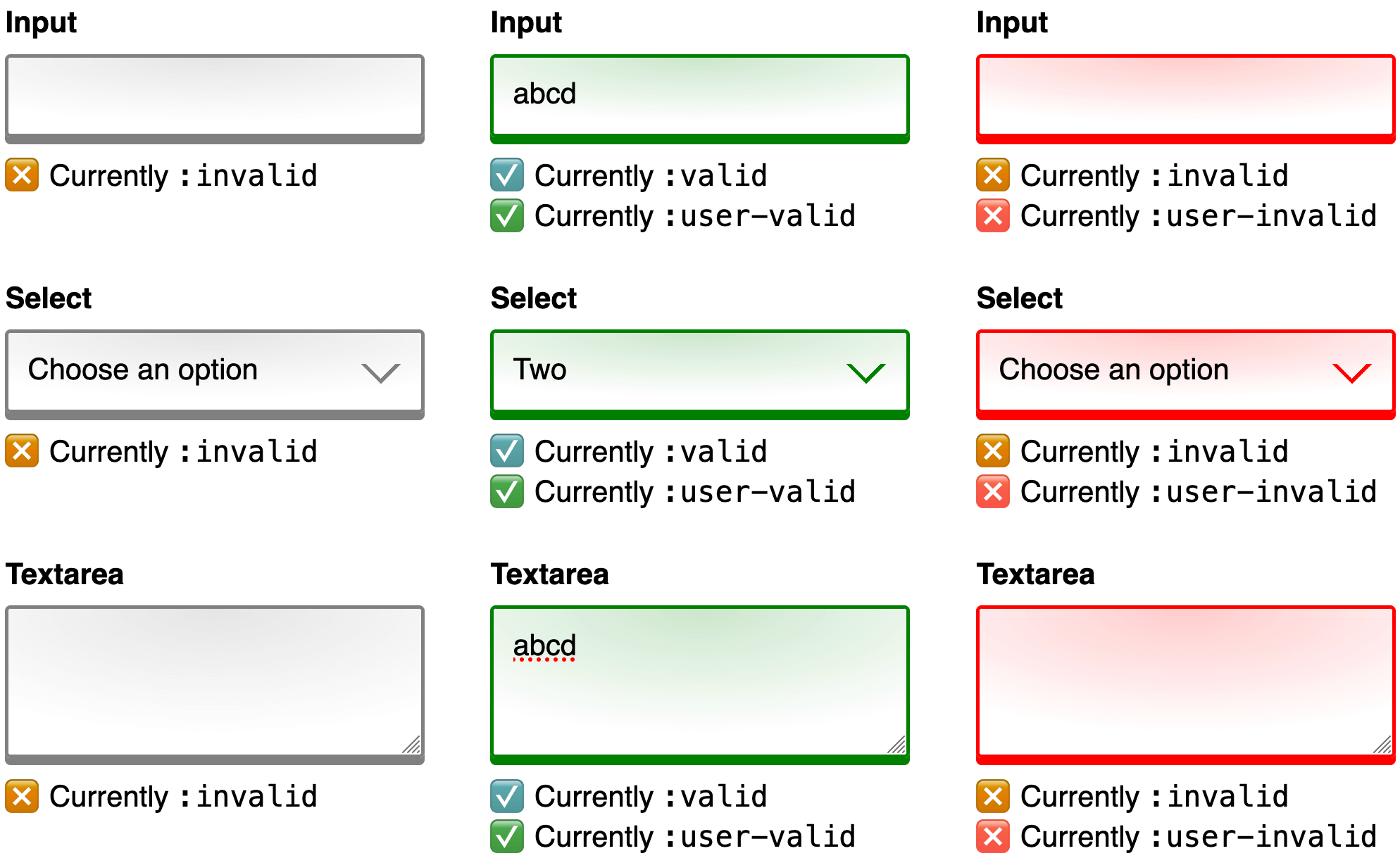
选择器根据用户交互和验证约束的组合进行匹配。与以下演示进行交互以查看它们的实际效果
以更少的代码获得更好的用户体验
如果没有这些伪类,要实现 :user-valid 和 :user-invalid 启用的用户体验,需要编写额外的有状态代码。该代码需要跟踪初始值、输入的当前焦点状态、用户对值所做的更改程度、运行额外的有效性检查,最后添加一个类来选择样式。现在,您可以依靠浏览器来自动处理所有这些。
更多资源
- :user-valid - MDN Web 文档
- :user-invalid - MDN Web 文档
- User-interaction Pseudo-classes - W3C 编辑草案
- Form Constraint Validation - MDN Web 文档
- Forms Accessibility Tutorial - Web 无障碍功能倡议
封面照片由 Behzad Ghaffarian 在 Unsplash 上拍摄。